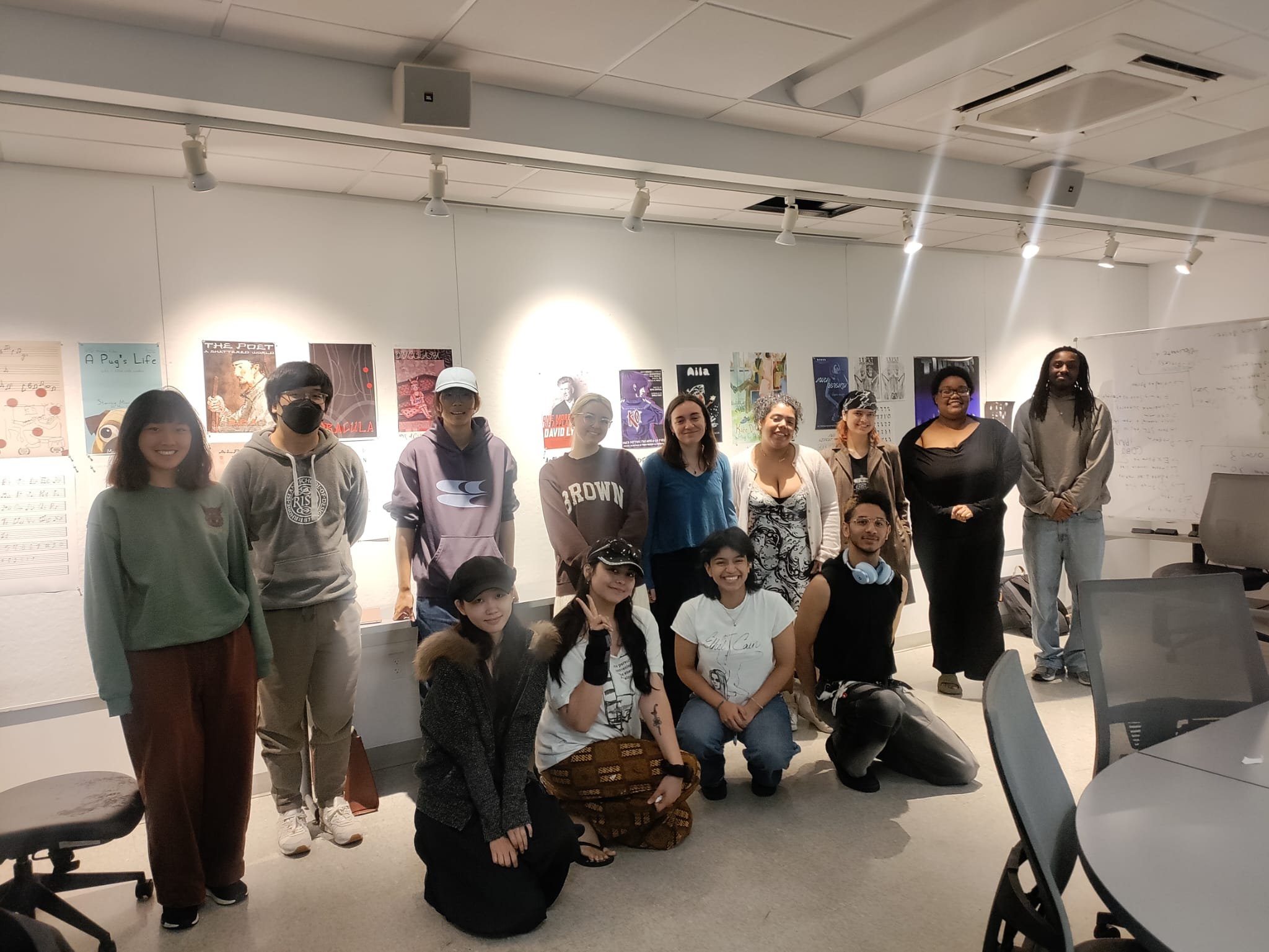
Typography for Illustrators
Rhode Island School of Design
Department of Illustration
Spring 2025 • Undergraduate Course
Note: This course is originally taught at RISD by Rafael Attias. I taught this course during the Spring 2025 semester with a new syllabus developed independently from the original.
This course was designed to help students develop a sensitivity for typographic design, its role within the larger principles of graphic design in general, and the many ways in which it intertwines with image-making and illustration. It encouraged appreciation for the designerly contexts in which illustrated material is often situated, which often includes a prominent relationship to text and typography. They explored key principles and concepts of designing with type in various contexts through assignments that helped them blend image-making, text and layout design in various permutations, learning how to navigate and wield text-as-text, text-as-image and everything in between. While the principles grounding this class were rooted in the practice of graphic design, the assignments helped them understand them in specific relationship to image-making and illustration.

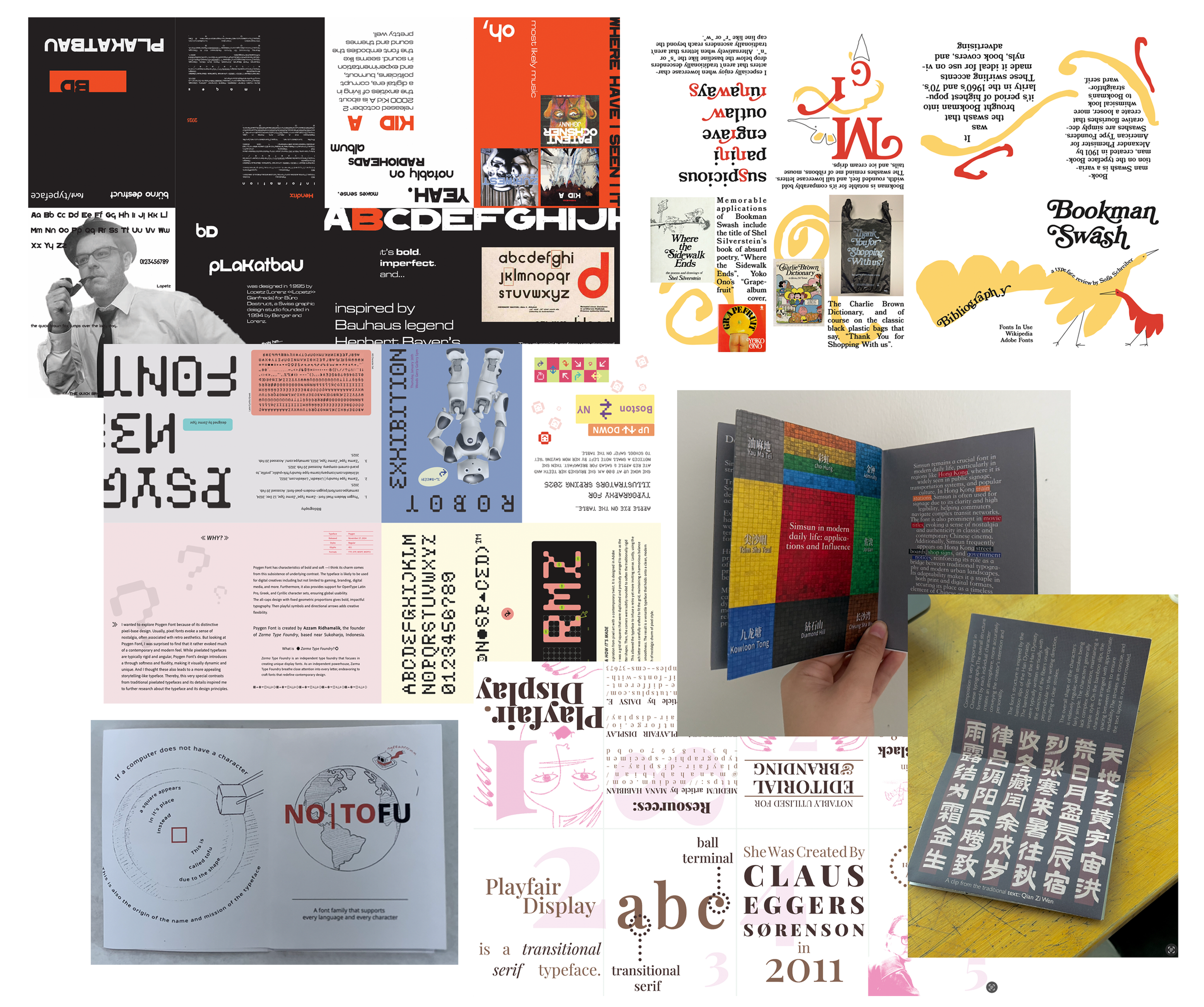
01 • Font Review Zine
Inspired by Bethany Heck’s Font Review Journal, students researched and reviewed a typeface of their own choosing and produced a short essay about it in the form of a zine. The zine was meant to educate us on the history of the font, its design particularities and its various applications. The assignment was not only an opportunity to learn about a new typeface, it will also to exercise their layout design skills through a mini publication format.
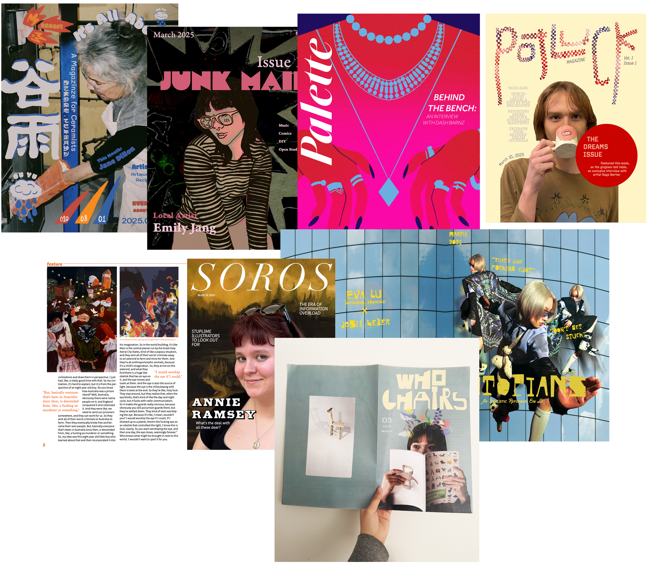
02 • The Magazine Interview
The magazine is a fantastic opportunity for employing type in a variety of different configurations – mastheads, titles, subheaders, eyebrow headers, captions, footnotes, pull-quotes, etc. In this assignment, students interviewed a fellow artist and presented it as an interview in a hypothetical magazine, designing a cover and three page layouts featuring all the necessary typographic hierarchy.
03 • Musical Type
Students selected a song or music album of their choice and then produced a creative artefact that featured its lyrics in a prominent fashion: a lyric video, a vinyl jacket, a cassette tape/CD case, etc. The goal of the assignment is to appreciate how mood and vibe are produced by typographic choices and understand its relationship to other design elements like imagery, colour and motion.

04 • The “Ugly Font” Challenge
Students each picked an “ugly font” – an overly decorative display font that, as most graphic designers would brand a “nightmare to work with”. Ugly fonts are seen this way because there are very few contexts for their use, and they often stand out in unseemly ways, struggling to blend cohesively into a layout design. Students were tasked to create any artefact of their choice inspired by their given font. This assignment was designed to demonstrate how illustrators, unlike graphic designers, might have the unique advantage of appreciating the image-like/illustrative qualities of an “ugly font” and design an aesthetically cohesive artefact that could make their font feel like the right fit.

05 • The Cue Card Monologue
Students picked a monologue (from a movie/tv show, a comedian’s standup routine, a famous leader’s speech, etc) and then presented it as a “Love-Actually-style” silent cue card performance. All the text was presented on cue cards playing with font, scale, transparency, layout, etc to convey the tone of the monologue, and very sparely using colour, illustrations, etc to deliver moments of impact/surprise. This was a pure typography assignment to test how they convey rhythm, tone, pacing and intention entirely through text-based composition.

06 • Comics Journalism
Students selected two real world news articles/news clips that were diametrically opposite in tone and subject matter. They then converted those articles each into one-page comics featuring hand-lettered/comic type. The assignment was designed to help them appreciate how tonal qualities of a story could be manipulated through both text and illustration, and the nuanced role of hand-lettered typography in comic layouts.

07 • Personality Typeface + Biopic Poster
Fonts carry personality, and this two-part assignment let students get a brief taste of designing and applying their own font inspired by a real person. The person could be a public figure or simply a friend/relative, and they had to design a typeface that included uppercase and lowercase characters, numerical figures and standard punctuation, whether digitally or through more physical/material/experimental means. They then used their new font to design a hypothetical biopic movie poster about their chosen individual, to understand how their typeface worked in application.